|
|
|
|
|
|
|
Telerik UI for Blazor
Blazor gives you the ability to write rich web apps with C# rather than JavaScript. Telerik UI for Blazor components have been built from the ground-up to ensure you experience shorter development cycles, quick iterations and cut time to market.
Key Features

Template Support
With native components, the Telerik UI for Blazor Grid templates can fully utilize the best features of Blazor to highly customize the user experience.
Native Blazor Validation Integration
The UI for Blazor suite supports and integrates seemlessly into Blazor's Forms and Validation infrastructure. All Telerik UI for Blazor Input components work out of the box when placed inside an EditForm, respond to EditContext changes and provide default invalid styles.

Modern design
Telerik UI for Blazor provides Material, Bootstrap and Default themes that you can use to achieve modern design of your Blazor application. Thanks to the Theme Builder you can even customize the existing themes or create a new one to fit your needs.
Get The Best Value for Your Money

ROI / Cut Development Time
We combine our winning client-side technology and our server-side solutions in price-friendly bundles. Javascript, ASP.NET, PHP, and JSP – the complete package!
For one low price you get the individual technologies you need for your specific project including our extensive library of components, three major update releases per year, and flexible support options. Value and convenience in one package.

Leading Support
Get answers to your questions directly from the developers who build this UI suite, even during your trial period.
If you are not a developer or don't have time to evaluate our product, send us your project requirements. We will evaluate your required features and let you know how our products fit your needs.

Buy as Part of Devcraft
Telerik .NET and Kendo UI JavaScript components and Reporting and Productivity tools enable you to build modern and high-performant apps on any web, desktop or mobile platform—fast. Comes with flexible support options designed to cover your every need.
Optimize your time and budget by taking advantage of our intuitive APIs, thousands of demos with source code availability, comprehensive documentation and a full assortment of VS templates.
Explore our Native UI Blazor Components
DATA MANAGEMENT
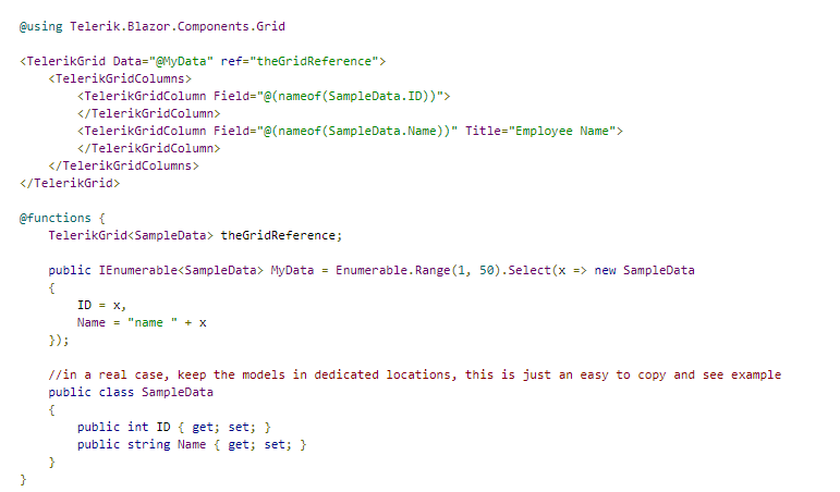
To create a basic Telerik Grid:
Get started with a grid by providing it with a data collection
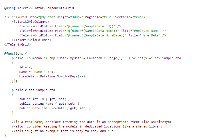
The result from the code snippet above

You can also use a string for the field name, using the nameof operator is not necessary. For example, the ID column can be defined like this: .
Reference
The grid is a generic component, and to store a reference, you must use the model type that you pass to its Data when declaring the variable.
Store a reference to a Telerik Grid
NAVIGATION
The Button component provides styling according to the chosen theme, click event and icons. You can also disable the button through a property.
Basic Button
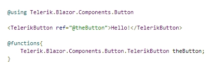
To add a Telerik Button to your Blazor app, use the tag:
Basic Telerik Button tag

The result from the code snippet above

Component namespace and reference
Click Handler
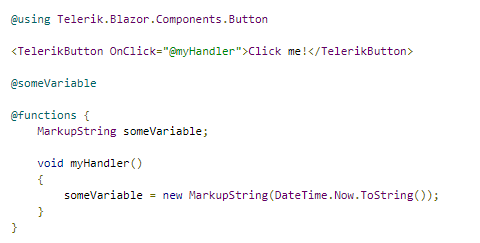
To attach a click handler, use the OnClick attribute and define the method in the functions section.
Click handler for a Telerik Button
Styling
You can style the button through its Class attribute to define your own CSS rules that apply to the HTML rendering.
Set CSS class to the button and change its appearance

The result from the code snippet above

You can also make the button use a strong color to attract attention, called Primary button styling. To do that, set its Primary property to true.
Button with the Primary color scheme from the current theme

The result from the code snippet above, with the Default theme

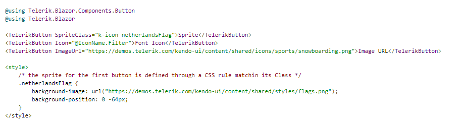
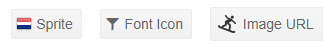
Icons
You can put an image, sprite or a font icon in the button to illustrate its purpose for your end users. To apply them, use the following properties:
You can see how to use the built-in icons in the Font Icons article.
For a custom font icon, define the font and glyph in your Icon CSS class.
The following example shows how to use an image from a URL, a sprite image, and the built-in font icons.
How to use icons in Telerik Button
 The result from the code snippet above
You can use relative paths to your images in the wwwroot folder. The example above uses absolute paths to make it easy for you to see the results without preparing images.
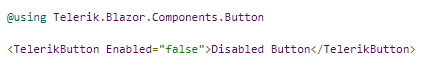
Disabled State
To disable a button, set its Enabled attribute to false.
Disabled Telerik Button
Comparison between disabled and enabled button

Button Type
The button renders a

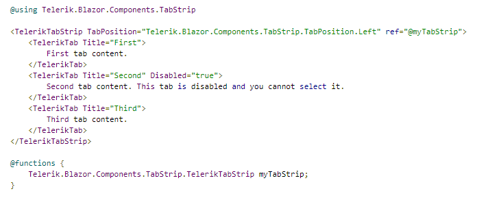
The Tab Strip is defined through the tag that accepts children of type . Inside the tabs you can add content like in any other container, including other components.
The tab exposes a Title attribute that is the text rendered in the heading. It also offers the Disabled attribute that allows you to disable its selection.
To control the position of the tab titles, the main tab strip tag exposes the optional TabPosition attribute that takes a member of the Telerik.Blazor.Components.TabStrip.TabPosition enumeration:
A Telerik Tab Strip with example reference, tab position and disabled tab
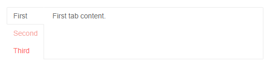
The result from the code snippet above
Get selected tab
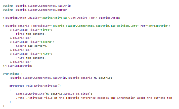
Select Tab programmatically

EDITORS
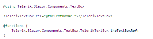
The Textbox component allows the user to enter a generic plain text message. The developer can control minimum, maximum length of the text, pattern, and other elements of the UX such as label or class.
To use a Telerik Textbox for Blazor, add the TelerikTextBox tag.
Basic textbox with its key features, and ValueChanged event handling
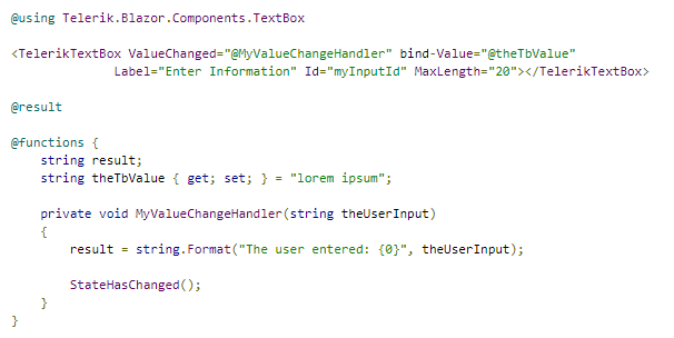
Component namespace and reference
The numeric textbox provides the following features:
The length, enabled and pattern attributes are HTML attributes on the element and it is up to the browser to honor them. For example, the minlength attribute is rarely taken into account, and the pattern is usually evaluated only upon form submission.
The Numeric Textbox component allows the user to enter decimal values and no text. The developer can control minimum, maximum values, steps and other elements of the UX.
To use a Telerik Numeric Textbox for Blazor:
HTML
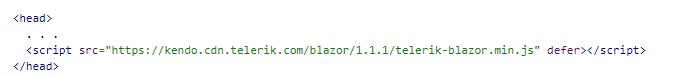
Make sure that the version in the URL matches the version of the Telerik Blazor package used in your project.
The numeric textbox component is generic, meaning that it takes the type of its value parameter as an argument. It can take int, long, float, double and decimal values. Therefore, the values for the Min, Max and Step properties must be of the same type as the Value, and the ValueChanged handler must also accommodate the corresponding value type.
Component namespace and reference
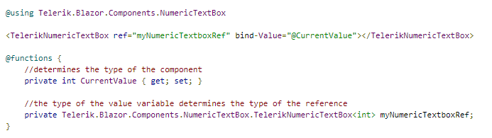
The numeric textbox provides the following features:
The Date Input component allows the user to enter a date. The developer can control the format of the date. If the user input does not match the desired pattern, the value is not accepted. If the input can be parsed, it will be corrected automatically.
To use a Telerik Date Input for Blazor:
HTML

Make sure that the version in the URL matches the version of the Telerik Blazor package used in your project.
The date input provides the following features:
The Date Picker component allows the user to choose a date from a visual list (calendar) or to type it into a date input that can accept only dates. You can control the format shown in the input, how the user navigates through the calendar, and dates the user cannot select.
To use a Telerik Date Picker for Blazor:
HTML
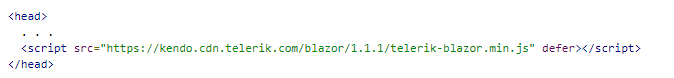
Make sure that the version in the URL matches the version of the Telerik Blazor package used in your project.
The Date Picker component exposes the following features:
The date picker is, essentially, a date input and a calendar and the properties it exposes are mapped to the corresponding properties of these two components. You can read more about their behavior in the respective components' documentation.

© Copyright 2000-2025 COGITO SOFTWARE CO.,LTD. All rights reserved