Property Grid for ActiveX COM
Property Grid for ActiveX COM provides Windows developers with a comprehensive, fully customizable property grid giving your application a professional and modern interface. Windows developers can easily create a hierarchical list of editable properties and represent any data type or sub-item.
Features Overview
Codejock Property Grid for ActiveX COM provides several options to choose from including Integrated Toolbar and Help Panel, Hierarchical Editable List, Inplace Button Controls, Data Sorting, Combo List, Splitter Sizing, Masked Edit, Visual Studio and Office Theme Support, Built in Data Types and much more! Property Grid is included with the Suite Pro for ActiveX COM evaluation.
⑴ Theme Support
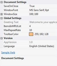
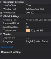
Visual Studio 2012
Codejock Software's Property Grid provides your application with full Visual Studio 2012 theme support that gives your application the closest, most exact Visual Studio 2012 style themes of any 3rd party tool available today. Visual Studio 2012 is already built in, so you don't have to spend any extra time on this. This allows you the ability to stay ahead of the competition with the latest in application GUI design.
Light theme example
Dark theme example
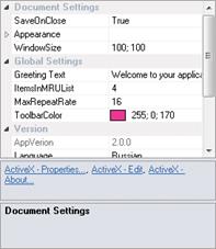
Visual Studio 2010
Codejock Software's Property Grid provides your application with full Visual Studio 2010 theme support that gives your application the closest, most exact Visual Studio 2010 style themes of any 3rd party tool available today. Visual Studio 2010 is already built in, so you don't have to spend any extra time on this. This allows you the ability to stay ahead of the competition with the latest in application GUI design.
Office 2010
Codejock Software's Property Grid provides your application with full Office 2010 theme support that gives your application the closest, most exact Office 2010 style themes of any 3rd party tool available today. Office 2010 is already built in, so you don't have to spend any extra time on this. This allows you the ability to stay ahead of the competition with the latest in application GUI design.
Blue theme example
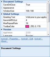
Black theme example
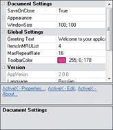
Silver theme example
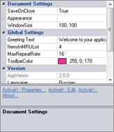
Office 2013
Codejock Software's Property Grid provides your application with full Office 2013 theme support that gives your application the closest, most exact Office 2013 style themes of any 3rd party tool available today. Office 2013 is already built in, so you don't have to spend any extra time on this. This allows you the ability to stay ahead of the competition with the latest in application GUI design.
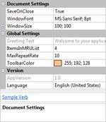
Office 2007
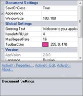
Codejock Software's Property Grid provides your application with full Office 2007 theme support that gives your application the closest, most exact Office 2007 style themes of any 3rd party tool available today. Office 2007 is already built in, so you don't have to spend any extra time on this. This allows you the ability to stay ahead of the competition with the latest in application GUI design.
Blue theme example.
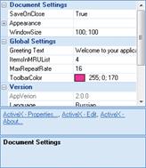
Black theme example.
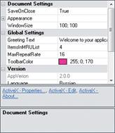
Silver theme example.
Office 2003
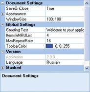
Codejock Software's Property Grid provides your application with full Office 2003 theme support that gives your application the closest, most exact Office 2003 style themes of any 3rd party tool available today. Office 2003 is already built in, so you don't have to spend any extra time on this. This allows you the ability to stay ahead of the competition with the latest in application GUI design.
Windows XP
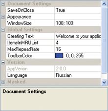
Codejock Software's Property Grid provides your application with full Windows XP theme support that gives your application the closest, most exact Windows XP style themes of any 3rd party tool available today. Windows XP is already built in, so you don't have to spend any extra time on this. This allows you the ability to stay ahead of the competition with the latest in application GUI design.
Delphi
Codejock Software's Property Grid provides your application with full Delphi theme support that gives your application the closest, most exact Delphi style themes of any 3rd party tool available today. Delphi is already built in, so you don't have to spend any extra time on this. This allows you the ability to stay ahead of the competition with the latest in application GUI design.
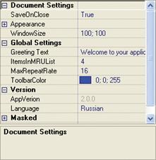
Cool
Codejock Software's Property Grid provides built in theme support for a "cool" appearance. You can choose this theme for a more classic windows appearance, or choose from several pre-defined theme styles created for Property Grid.
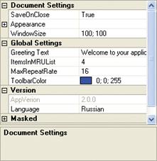
Simple
Codejock Software's Property Grid provides built in theme support for a "simple" appearance. You can choose this theme for a more classic windows appearance, or choose from several pre-defined theme styles created for Property Grid.
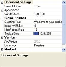
Default
Codejock Software's Property Grid provides built in theme support for a "default" appearance. You can choose this theme for a more classic windows appearance, or choose from several pre-defined theme styles created for Property Grid.
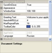
⑵ General Features
Integrated Toolbar
Property Grid comes with its own toolbar built in for sorting data which can easily be turned on or off. The toolbar supports categorized and alphabetical sorting routines.

Integrated Help Panel
Property Grid comes with an integrated help panel that you can use to display helpful hint about selected items in your property grid. This feature can easily be turned on or off.

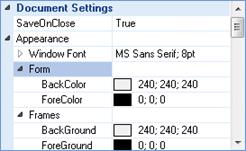
Hierarchical List
Property Grid allows you to display your data in a hierarchical list for editing. You can easily group multiple levels of data that can be displayed by expanding or collapsing property groups.
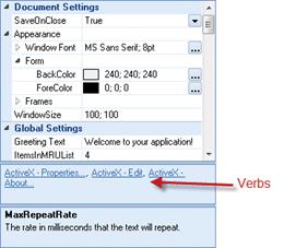
.Net Style Verb Panel
Verbs will be displayed in a separate panel just below the property grid. Verbs are links that can be used to perform actions in your application. If both the verb panel and help panel are visible at the same time, the verb panel is displayed above the help panel.
A PropertyGridVerb is a link similar to what is seen in Visual Studio .NET. For example, when the DataGrid control is selected at design time in VS .NET, an AutoFormat link button appears in the Properties window just below the property grid and above the help panel.
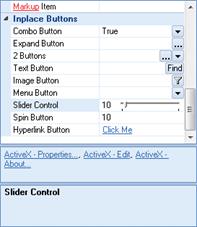
Inplace Buttons
Property Grid allows you to add in-place buttons to your data values. These buttons can be shown all the time or only when the item has focus. For example, you can add a "find" button to a text field.
Data Sorting
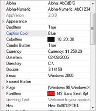
Property Grid allows you to sort your data by category, alphabetical, or leave it unsorted. This built in feature allows greater control over how your data is displayed.
Sort your data by category
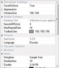
And alphabetically
⑶ Customization
Combo List
You can use the Property Grid's "combo button" to create a combo style drop-down list.

Edit Property
You can use the Property Grid's "expand" button to display your own custom dialog when the user clicks on the expand button. You can add the expand button to any of the data types that do not normally have one.

Splitter Position
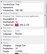
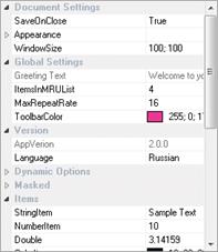
Property Grid allows you to change the position of the splitter that splits the data from the description in your property grid. This allows you to easily adjust the splitter so you can display as much or as little of the data description as you like.
Splitter position set to 30%
Splitter position set to 70%
Mask Edit
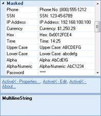
You can use the Property Grid's "mask edit" property which allows you to create a mask edit style property item. You can use any combination of "mask characters" combined with additional characters to create a restrictive field for text entry. For example, if you wanted to display a prompt for a telephone number, you can restrict data entry to only numeric values with the first three numbers inside of parentheses.
Item Metrics
Property Grid allows the use of XAML code snippets to be used for formatting text of the categories and items in the property grid.

Customizable Appearance
Property Grid allows you to customize the appearance of the property grid by setting your own colors and fonts for the control. Combined with the ability to hide/show the toolbar and help panel, gives you greater control over how your grid will appear.
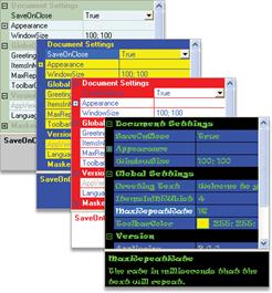
⑷ Built in Data Types
Boolean
You can use the Property Grid's "Boolean" data type to create a Boolean (true/false) style property item.

Color
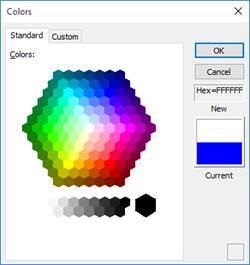
You can use the Property Grid's "Color" data type to create a Color style property item that will display a "color picker" dialog when you click on the expand button that allows you to choose any of the predefined colors, or you can define a custom color.
Color data type
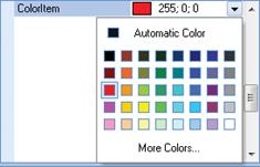
A color picker dialog is included to select colors
Date
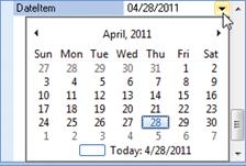
You can use the Property Grid's "Date" data type to create a Date style property item that will display a "date picker" when you click on the expand button that allows you to choose the day, month, and year from a GUI.
Double
You can use the Property Grid's "double" data type to create a Double style property item that will store a decimal point along with the number so you can perform precise calculations.

Font
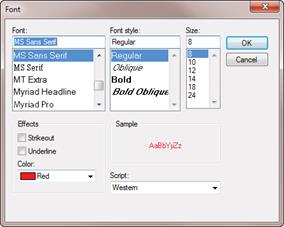
You can use the Property Grid's "font" data type to create a font style property item. This property item will display a browse button that when pressed will display a font selection dialog.
Font data type.

A Font selector dialog is included.
Number
You can use the Property Grid's "number" data type to create a number style property item.

Picture
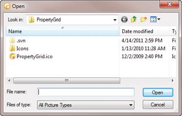
You can use the Property Grid's "picture" data type to create a picture style property item. This property item will display a browse button that when pressed will display a file selection dialog that allows you to import a picture file. Supported picture formats include bmp, ico, and cur just to name a few.
Picture data type

A file selection dialog is included to choose your picture
Read Only
You can use the Property Grid's "read only" data type to create a property item that is read only. Users will be able to see the data, but can not edit it.

Text
You can use the Property Grid's "text" data type for text based properties.

Options Data Type
You can use the Property Grid's "options" data type to add options and radio buttons. This is useful when a property can have more than 1 value or you want to allows them to select 1 or more values for a given property.

Dynamic Data Types
You can use the Property Grid's "dynamic" data types to show or hide more options based on the value of another value.

⑸ Supported Environments
Visual Studio 2019
Visual Studio 2017
Visual Studio 2015
Visual Studio 2013
Visual Studio 2012
Visual Studio 2010
Visual Studio 2008
Visual Studio 2005
Visual Studio 2003
Visual Studio 2002
Visual Basic 6.0
Microsoft Access
Visual FoxPro
Delphi
Html
⑹ Operating Systems ( x32, x64 )
Windows 10
Windows 8.1
Windows 8
Windows 7
Windows Vista
Windows XP
Windows Me
Windows 2000
Windows 98 SE
Windows 98
Windows 95
Windows Server 2016
Windows Server 2012 R2
Windows Server 2012
Windows Server 2008 R2
Windows Server 2008
Windows Server 2003 R2
Windows Server 2003
Windows Server 2000
Windows NT 4.0
⑺ Minimum Requirements
Visual Basic 6.0
Windows 95 / NT 4.0
© Copyright 2000-2025 COGITO SOFTWARE CO.,LTD. All rights reserved