FireDataGrid
Binaries and Delphi 10 Seattle, 10.1 Berlin DCUs for building under Windows 32 and Mac OSX 32 target platforms. Demo version for Windows contains executable files (*.exe) which can be started without compiling for quick evaluation.

Demo version for Mac OS X contains executable bundles (*.app) ONLY which can be started without compiling for quick evaluation. If you wish to evaluate component in a development process please use Windows variant of installer and make a build for Mac OS X from Delphi IDE.

FireDataGrid is a modern DataGrid control to display tabular data in enterprise's business applications that are developing in Delphi Firemonkey.
Grid uses the paradigm View - DataModel. So it makes it suitable for using in DB-aware scheme: GridView-TDataSource-TDataSet.
High productivity in working and displaying large amounts of data is achieved in the virtual mode of creating rows that are visible on the screen only.
Component implements functional that required to create business applications across the enterprise with maximum productivities.
FireDataGrid requirements:
Minimum Delphi XE6 is required to start building application with FireDataGrid.
FireDataGrid Features are:
•DataSet - allows to work with any type of bidirectional sequential and non-sequential DataSets (DataSet.IsSequenced is True or False).
•Sorting - allows to sort data in column or several columns without support of sorting in DataModel.
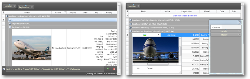
•Grouping - allows to group data by one or several columns. For that is needed to drag column to grid's header like Microsoft Outlook does. This operation can be programmed in the code, so that the end-user has a ready view.
•Fixed Columns - allows to freeze some columns at the left or at the right of the grid's view to prevent horizontal scrolling of them.
•Fixed Rows - allows to freeze rows at the top or bottom of the grid's view to prevent vertical scrolling of them.
•Filters - allows to apply filters for data providers that are connected to the grid view. Filters do not interfere with the data source work and live only on the side of view. To create a filter, there are 3 ways. End user can select the filter dialog by pressing Ctrl+F in the selected cell. End user can select filter in the popup window by clicking on funnel on the right side of columns or it is possible setup the filter's condition by coding. Filters support the history so the end user can use the navigation on the conditions that have been used before.
•Zooming - allows to increase or decrease instantly the size of the grid's view by proportional increasing or decreasing the size of the font
within the cells and elements of the grid. This can be done by pressing a combination of keys Ctrl+Plus, Ctrl+Minus or from code.
•Summaries - allows to count the summaries and display them in the footer of the grid. It is possible to calculate and display the summary
for the whole column at once, or if the grouping has been made, the summary only for formed group. Number of sub-groups does not matter.
In the footer of each group the grid creates a special row that contains the value of the summary.
•Field Chooser and Quick Customization - standard features that allows to quickly find and make it visible the invisible columns and vice versa.
•Scrolling by Rows and Scrolling by Pixels - allows to configure the grid so that the vertical scrolling will be carried out by pixel or row by row. The effect of scrolling by pixels looking good for the rows that display the images inside the cells. For large amounts of data with boring figures the scrolling by row look more preferable.
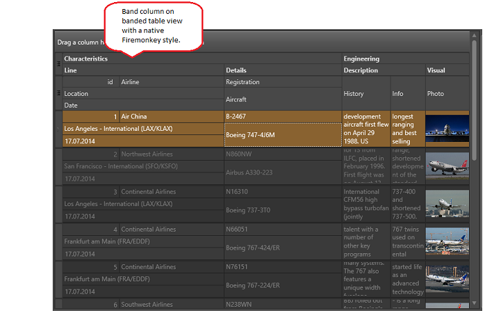
•Banded Columns - allows to group the column headings in separate bands. Bands represent a separate headings, but that are not have a cells
associated with them inside the view. Bands can be nested. Grid allows to resize the bands in width and height by end-user action or from code.
•Row Auto Height Mode - makes it possible to maintain the height of the cell (and row in result) of the grid in the optimal size during resize in the width. For example, it allows to display the picture without distortion or integrate multi-line text in a cell totally. For optimization the heights of the grid's rows are calculated only for those rows that are visible on the screen (if feature of vertical scrolling by pixels is not used).
•Column Auto Width Mode - allows to maintain and, if necessary, change the column width proportionally, so that they occupied the entire width of the grid view. If thus auto height feature was enabled then the height of the row will vary too.
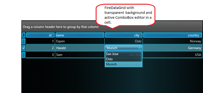
•FireMonkey's Style - to display the contents and elements, grid uses a native Firemonkey style from the form's scene or from TStyleBook that being connected to the scene.


© Copyright 2000-2025 COGITO SOFTWARE CO.,LTD. All rights reserved