
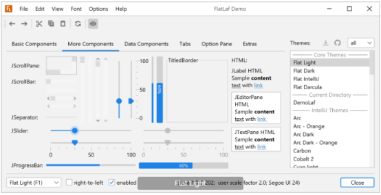
FlatLaf is a modern open-source cross-platform Look and Feel for Java Swing desktop applications.
It looks almost flat (no shadows or gradients), clean, simple and elegant. FlatLaf comes with Light, Dark, IntelliJ and Darcula themes, scales on HiDPI displays and runs on Java 8 or newer.
The look is heavily inspired by Darcula and IntelliJ themes from IntelliJ IDEA 2019.2+ and uses almost the same colors and icons.
To enable FlatLaf, add following code to your main method before you create any Swing component:
FlatLightLaf.setup();
// create UI here...
or
try {
UIManager.setLookAndFeel( new FlatLightLaf() );
} catch( Exception ex ) {
System.err.println( "Failed to initialize LaF" );
}
// create UI here...
Flat Light
Flat IntelliJ
Flat Dark

Flat Darcula

IntelliJ Platform based products (e.g. IntelliJ IDEA or WebStorm) support 3rd party theming thru plugins, which internally use JSON files (with extension .theme.json) to describe the UI theme.
FlatLaf supports loading such 3rd party .theme.json files and using them as a Laf.
This addon for FlatLaf bundles many popular open-source 3rd party themes from JetBrains Plugins Repository into a JAR and provides Java classes to use them.
Use FlatLaf Demo to try them out.
If you use Maven or Gradle, add a dependency with following coordinates to your build script:
groupId: com.formdev
artifactId: flatlaf-intellij-themes
version: (see button below)
Use the FlatLaf Demo, which bundles many popular open-source 3rd party themes from JetBrains Plugins Repository, to try them out.
You can also go to the JetBrains Plugins Repository and browse available IntelliJ theme plugins at plugins.jetbrains.com/search?tags=Theme. If you found a good one, click on the "Source Code" link at the bottom of the theme page, which redirects you to the source code repository of the theme. There you can search for a .theme.json file and download it.
Tip: If you copy a .theme.json file into the same folder as the FlatLaf Demo JAR, you can try this theme in the demo. Select the theme from the "Current directory" section in the themes list.
To use a .theme.json file in your application, which is not contained in the FlatLaf IntelliJ Themes Pack, save it somewhere into your application's resources (or src) folder and use following code to load and initialize it:
IntelliJTheme.setup( MyApp.class.getResourceAsStream(
"/com/myapp/themes/arc-theme-orange.theme.json" ) );
// create UI here...
You can customize the appearance of FlatLaf to some degree by setting UI defaults with:
UIManager.put( "someKey", someValue );
Note: Invoke UIManager.put() always after setting the look and feel with e.g. FlatLightLaf.install() (but before creating the components). Otherwise, the system look and feel is temporary installed before FlatLaf is installed, which may make application startup slower.
This page describes only some of the available settings. More can be found in the properties files here.

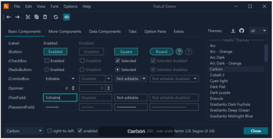
Buttons, toggle buttons, combo boxes and spinners use rounded corners by default. If you prefer square corners use:
Java Properties
UIManager.put( "Button.arc", 0 );
UIManager.put( "Component.arc", 0 );
UIManager.put( "CheckBox.arc", 0 );
UIManager.put( "ProgressBar.arc", 0 );
Button.arc is the corner arc diameter for buttons and toggle buttons (default is 6), Component.arc is used for other components like combo boxes and spinners (default is 5), CheckBox.arc is used for check box icon (default is 4) and ProgressBar.arc is used for progress bars (default is 4).
Text fields use square corners by default. If you prefer rounded corners use:
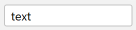
Java Properties
UIManager.put( "TextComponent.arc", 5 );
Use large values for arc to get "round" components:
Java Properties
UIManager.put( "Button.arc", 999 );
UIManager.put( "Component.arc", 999 );
UIManager.put( "ProgressBar.arc", 999 );
UIManager.put( "TextComponent.arc", 999 );
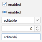
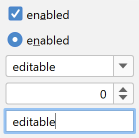
You can enable round corners also on individual components with:
myButton.putClientProperty( "JButton.buttonType", "roundRect" );
myComboBox.putClientProperty( "JComponent.roundRect", true );
mySpinner.putClientProperty( "JComponent.roundRect", true );
myTextField.putClientProperty( "JComponent.roundRect", true );

chevron

triangle
Some components (e.g. combo boxes, spinner, tree, etc) use arrows. FlatLaf supports two types of arrows: chevron and triangle.
To change the arrow type for all arrows in FlatLaf use:
Java Properties
UIManager.put( "Component.arrowType", "chevron" );
or
UIManager.put( "Component.arrowType", "triangle" );

Most focusable components in FlatLaf (e.g. button, combo boxes, text fields, etc) indicate the focused state with special borders. The Flat Light and Flat Dark themes use a different color on the existing border (outer focus width is 0). On the other hand the Flat IntelliJ and Flat Darcula themes use outer borders of width 2, which are painted outside of the component.
You can control the width of the outer focus border in all themes with:
Java Properties
UIManager.put( "Component.focusWidth", 1 );
Note: Using outer focus border increases the size of components.

In addition to the outer focus border, FlatLaf also supports inner focus borders, which do not increase the size of components. Default inner focus width is 0.
You can change the inner focus width using:
Java Properties
UIManager.put( "Component.innerFocusWidth", 1 );
Mnemonics are hidden by default and made visible when Alt key is pressed. To make mnemonics always visible use:
Java Properties
UIManager.put( "Component.hideMnemonics", false );

The previous/next arrow buttons of scroll bars are hidden by default. To make them visible for all scroll bars in your application use:
Java Properties
UIManager.put( "ScrollBar.showButtons", true );
Or enable them on single components (JScrollPane or JScrollBar) with:
myScrollPane.putClientProperty( "JScrollBar.showButtons", true );
or
myScrollBar.putClientProperty( "JScrollBar.showButtons", true );
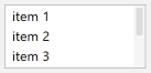
The default width of scroll bars is 10. To make them wider (or smaller) use:
Java Properties
UIManager.put( "ScrollBar.width", 16 );
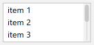
Thumb insets add empty space around the thumb:

Java Properties
UIManager.put( "ScrollBar.thumbInsets", new Insets( 2, 2, 2, 2 ) );
Track insets add empty space around the track:

Java Properties
UIManager.put( "ScrollBar.trackInsets", new Insets( 2, 4, 2, 4 ) );
UIManager.put( "ScrollBar.thumbInsets", new Insets( 2, 2, 2, 2 ) );
UIManager.put( "ScrollBar.track", new Color( 0xe0e0e0 ) );
Note: Track and thumb insets must be specified for vertical scroll bars. They are rotated for horizontal scroll bars.
Thumb can be rounded:
Java Properties
UIManager.put( "ScrollBar.thumbArc", 3 );
UIManager.put( "ScrollBar.thumbInsets", new Insets( 2, 2, 2, 2 ) );
Or round:

Java Properties
UIManager.put( "ScrollBar.thumbArc", 999 );
UIManager.put( "ScrollBar.thumbInsets", new Insets( 2, 2, 2, 2 ) );
Track can be also round:
Java Properties
UIManager.put( "ScrollBar.trackArc", 999 );
UIManager.put( "ScrollBar.thumbArc", 999 );
UIManager.put( "ScrollBar.trackInsets", new Insets( 2, 4, 2, 4 ) );
UIManager.put( "ScrollBar.thumbInsets", new Insets( 2, 2, 2, 2 ) );
UIManager.put( "ScrollBar.track", new Color( 0xe0e0e0 ) );
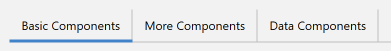
Separator lines can be shown between tabs:

Java Properties
UIManager.put( "TabbedPane.showTabSeparators", true );
Separator lines can take full height if you prefer this look:
Java Properties
UIManager.put( "TabbedPane.tabSeparatorsFullHeight", true );
To make the selected tab stand out, change the selected tab background:
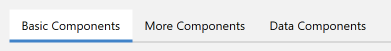
Java Properties
UIManager.put( "TabbedPane.selectedBackground", Color.white );

© Copyright 2000-2026 COGITO SOFTWARE CO.,LTD. All rights reserved