3 main types of data analysis are needed for everyday business decisions - comparison, transition and composition of data. This infographic tells you more about each of them and the javascript charts needed for each type of analysis.
Once you have identifed the audience for your chart,the metrics they need to see,and the data that will power the metrics, it is time to select the right chart type for your data. This selection depends on the type of data analysis your audience will need.In this infographic, we will see the common forms of data analysis for everyday business decisions,and the charts that facilitate them.
COMMON F0RMS OF DATA ANALYSIS
COMPARISON OF DATA
For identifying the highs and lows of data. Who is the best and worst sales guy among 10 individuals?
TRANSITION OF DATA
Applied to time-based data to understand the trend of change. Has the website traffic been going up or down over the last 30 days?
COMPOSITION OF DATA
To understand how a data value breaks down into its constituents.How does the website traffic break down into search,direct,referrals and campaigns?
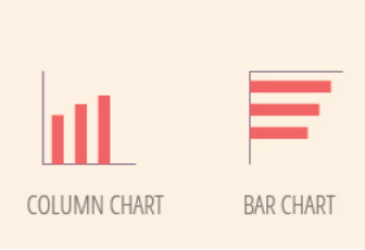
Who is the best salesperson? Let’s compare.
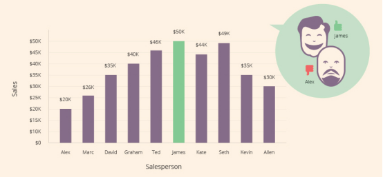
Column and bar charts are very much alike in terms of main functionality, but they differ when it comes to the length of the label they can accommodate. Bar charts being horizontal can take in longer labels.so if we had to display the full name of the salespeople, the bar chart would be better.

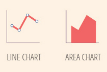
Has the website traffic been going up or down over the last 30 days? Let’s see the trend.
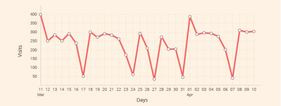
The data points are connected to each other in a line chart, so it is easier for the human eye to understand the trend of change as opposed to the column and bar chart where each data point is separate.
The area chart is very similar to the line chart and typically brings out the data better when used to plot a smaller set of data points since the entire area is colored.
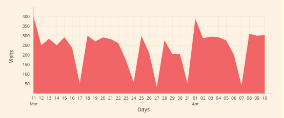
The area chart however can be "hard on the eyes when the data has sudden spikes and falls. As a rule of thumb, whenever you are unsure of which chart to pick,just stick to the simpler line chart.
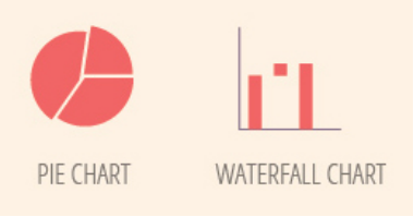
What is the breakdown of the website traffic?Let’s see the composition.
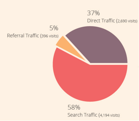
Points to remember when you are using the pie chart:
Another specialized form of composition analysis is when you have to show how a value increases or decreases to come to a final value.The waterfall chart which is an advanced variant of the column chart faciliates this analysis.
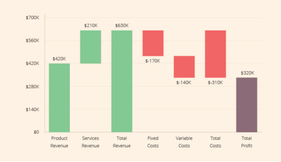
lt is a good idea to follow the universal code of green for values going up and and red for values going down.
The next time you are creating a chart, be sure to understand what kind of analysis you want to faciliate and then select the chart type. An incorrect chart type can lead to incorrect analysis which in turn can lead to incorrect business decisions. Happy charting!
FusionCharts Sulite XT is the industry/'s most comprehensive charting solution with 90+ chart types, powerful reporting capabilities like drill-down and chart export, and most of all,a delightful charting experience.


© Copyright 2000-2026 COGITO SOFTWARE CO.,LTD. All rights reserved