Businesses these days are becoming more and more analytics-driven, and applications powering these businesses are putting more emphasis than ever on their reports and dashboards. While plotting charts and gauges does help make more sense of the business data, the analysis can be empowered further by making the charts more usable.
Here we discuss advanced tips on how to make the charts in your reports and dashboards even more usable.
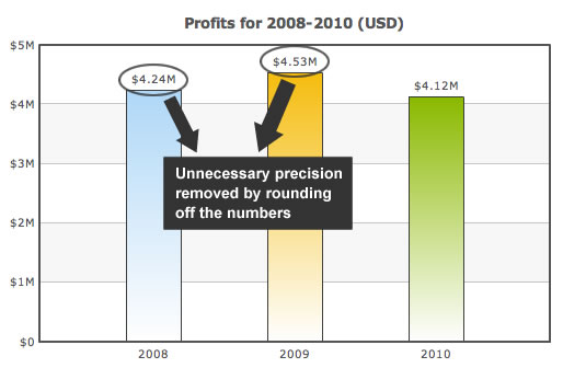
If you are talking about four million dollars of profits every year, then talking about the twenty five cents part of the figure doesn't add much value. Remove the unnecessary precision.

Round off the numbers to their nearest integer, or even hundreds and thousands.
Many a times during sales forecasting or project planning, you need to show predicted values on the chart. To avoid the user mixing up the known and the predicted values when he is deep in his analysis, show the predicted values using a dashed border.
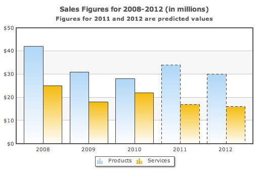
Dashed borders are sometimes used to highlight a data set as well. But with a small note in the caption or axis labels mentioning this, you can make it clear that you are showing predicted values using the dashed border.
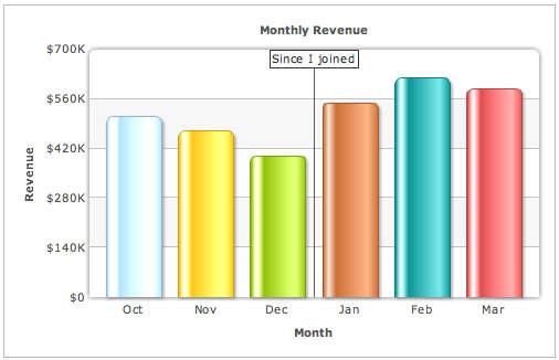
Say you are displaying monthly data from Nov 2010 to Aug 2011 which happens to be an irregular time period to plot data for. People are either used to seeing monthly data for all the 12 months one after another or quarterly data for all the 4 quarters one after another, but surely not monthly data for Nov 2010 to Aug 2011.
Typically, the dynamics from one calendar year to another change quite a bit. To make sure that the user knows when 2010 ends and when 2011 starts even when he is deeply immersed in his data analysis, put a vertical separator line between 2010 and 2011. Your data stays the same, just that with the separator you are doubly sure the user will know the transition from one year to another.

© Copyright 2000-2025 COGITO SOFTWARE CO.,LTD. All rights reserved