As the crypto boom gathers ever more momentum, many businesses around the world are jumping on the bandwagon and starting to trade and track cryptocurrencies. Even companies that want to avoid trading in this volatile market have realized that to remain competitive, they need to be open to the idea of using digital currencies to make and receive payments.
For these reasons, with the growing popularity of digital currencies internationally, more and more are finding it necessary to monitor and graph data related to blockchain and cryptocurrencies.
If you are a bitcoin enthusiast and interested in plotting blockchain data, FusionCharts is the right answer for you. FusionCharts is a comprehensive platform for creating stunning and beautiful charts, graphs, and maps, that can be easily integrated into your app.
Read on to find out how you can graph blockchain data using FusionCharts in a Javascript client. Yo start, we’ll plot the number of bitcoin transactions added to the mempool per second.
If you are looking for a crypto API, BlockChain.com provides a JSON feed for their charts and statistics data. For example, a basic blockchain query looks like this:

This query returns a result that is a JSON object, with the following structure. Please note that only the first two data points are shown below for readability.
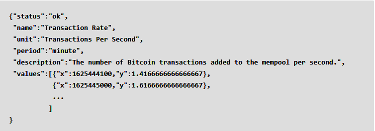
The data comes as (x,y) pairs in the “values” key.
What Does the FusionCharts BlockChain Data Graph Look Like?
If you are wondering what to expect when you choose a FusionCharts graph here is an example. In this instance, we have created a scatter graph of the number of bitcoin transactions added to the mempool per second. It looks like this:
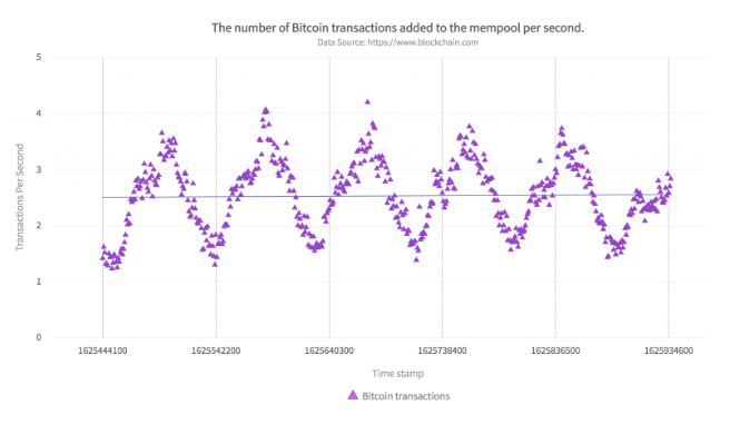
The graph above has several attractive features. These include:
1. FusionCharts automatically plots the regression line, shown as a blue solid line, to show the long-term data. It also computes the linear regression model.
2. You can customize the scatter plot colors and symbols.
3. Users specify the x-axis ticks and tick labels.
4. Users have 100% control over customizing the appearance and behavior of everything in the graph. This includes including the title, subtitle, axis labels, and everything else.
Creating a blockchain data graph with FusionCharts is easy. Here are the 4 easy steps you need to get going:
Step 1: Setup The Project
First, we’ll implement the project in Javascript using webpack. To begin, create a project directory called blockchainAPI. Open the command prompt and switch to the project directory. Next type the following to install webpack and FusionCharts:
Create two directories src and dist. In the src directory create a file called index.js. You can type the following at the command prompt:
To configure the project create a file called webpack.config.js in the main project directory. Add the following code to this file.
// webpack.config.js
const HtmlWebPackPlugin = require( 'html-webpack-plugin' );
const path = require( 'path' );
module.exports = {
context: __dirname,
entry: './src/index.js',
output: {
path: path.resolve( __dirname, 'dist' ),
filename: 'main.js',
},
plugins: [
new HtmlWebPackPlugin()
],
devServer: {
headers: {
"Access-Control-Allow-Origin": "*",
"Access-Control-Allow-Methods": "GET, POST, PUT, DELETE, PATCH, OPTIONS",
"Access-Control-Allow-Headers": "X-Requested-With, content-type, Authorization"
},
proxy: {
'/BlockchainAPI': {
target: 'https://api.blockchain.info',
pathRewrite: { '^/BlockchainAPI': 'https://api.blockchain.info/charts/transactions-per-second?timespan=1weeks&format=json'},
changeOrigin: true,
},
},
}
};
In the configuration file shown above, we have added a proxy for the blockchain.info URL to avoid any CORS error.
To import the FusionCharts libraries, first open the index.js file and add the following code. This will import all FusionCharts libraries in the project.
You also need to create a div tag for the chart container on the main HTML page. Below the import section add the following to your index.js file:
The fourth and final step is to import the blockchain data and create a JSON object for our chart. The “DataSource” key contains a nested key called “data”, which has the actual (x,y) points we want to plot. At the end of your index.js file, add the following code:
async function main() {
//Get the data
let response = await fetch('/BlockchainAPI');
let data = await response.json();
if (response.ok){
renderPage(data);
}
else {
alert('Error reading data from Blockchain Repository');
}
}
//renders the html page when passed data as JSON text
function renderPage(JsonText){
var dataSource = constructDataSource(JsonText);
renderChart(dataSource);
}
//constructs JSON text for 'dataSource' key
function constructDataSource(blockchainJson){
var dataset = [{
"seriesname": "Bitcoin transactions",
anchorbgcolor: "ff00ff",
data: blockchainJson.values
}];
var category = []
// Take around 5 transactions at equidistant points
var len = blockchainJson.values.length;
for (var i=0;i<len;i=i+Math.trunc(len/5)){
category.push({x: blockchainJson.values[i].x,
label: blockchainJson.values[i].x.toString(),
showverticalline: "1"
});
} //end for
var categories = [
{
verticallinedashed: "1",
verticallinedashlen: "1",
verticallinedashgap: "1",
verticallinethickness: "1",
verticallinecolor: "#000000",
category
}
];
var dataSource = {"chart": {
"caption": blockchainJson.description,
"subcaption": "Data Source: https://www.blockchain.com",
"xAxisName": "Time stamp",
"YAxisName": blockchainJson.unit,
"ynumbersuffix": "",
"xnumbersuffix": "",
"theme": "fusion",
"showRegressionLine": "1",
"plotToolText": "<b>$yDataValue</b> transactions at timestamp: <b>$xvalue</b>"
},
dataset, categories};
return dataSource;
}
// Draw the chart
function renderChart(dataSrc){
FusionCharts.addDep(Scatter);
FusionCharts.addDep(FusionTheme);
//Chart Configurations
const chartConfig = {
type: 'scatter',
renderAt: 'chart-container',
width: '80%',
height: '600',
dataFormat: 'json',
dataSource: dataSrc
}
//Create an Instance with chart options and render the chart
var chartInstance = new FusionCharts(chartConfig);
chartInstance.render();
}
//Call main method
main();
That’s it! We just created a beautiful visualization of the blockchain data using FusionCharts scatter graphs.
If you are looking for the quickest and most effective ways to create BlockChain Data Visualizations, you don’t need to look any further. That is because FusionCharts comes with a complete library of beautiful plots, charts, maps and graphs. In total, there are 100+ charts and 2000+ interactive maps you can easily integrate into your next app. You can also build impressive and effective dashboards, stunning interactive charts in addition to powerful illustrations using FusionCharts.
Start integrating dashboards and interactive charts in your financial apps by downloading the trial FusionCharts Suite XT today.
Take your data visualization to a whole new level
From column to donut and radar to gantt, FusionCharts provides with over 100+ interactive charts & 2,000+ data-driven maps to make your dashboards and reports more insightful

© Copyright 2000-2025 COGITO SOFTWARE CO.,LTD. All rights reserved