Ultimate UI for WPF
Fast and powerful UI controls for high-performance apps
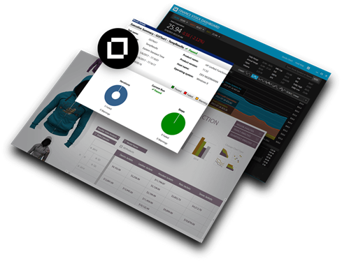
Create engaging modern and Microsoft Office-inspired apps for desktop and touch devices with lightning-fast grids and charts, dynamic data visualizations, and versatile controls. Modernize desktop applications and gain a 30% performance increase with .NET Core 3.
Ultimate UI Controls for WPF
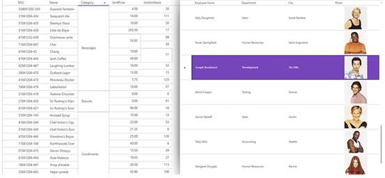
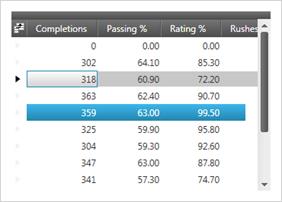
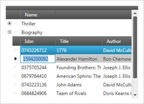
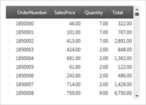
WPF Data Grid
Offers superior versatility and performance when editing, sorting, filtering, grouping, and showing hierarchical data relationships (such as master-detail records) in table format.
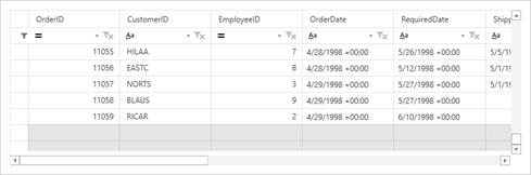
Hierarchical WPF Data Grid
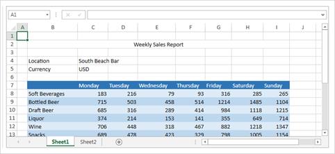
Supports complex data entry scenarios, custom layouts, rich printing and print preview, easy interoperability with Microsoft Excel and Microsoft Word, and an almost unlimited array of look and feel options.
Performance
Supports the ability to load and quickly scroll through thousands of records by leveraging cell virtualization and recycling.
Asynchronous Paging Data Source
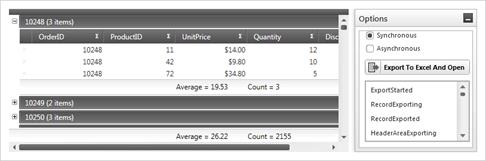
Give the data grid the ability to asynchronously load data on a separate thread, keeping your UI responsive. You’ll find it open-source and available for download on GitHub. We include source code for the supported data sources and sample applications demonstrating how to use them in your applications. You can even customize the appearance of unloaded data to align with your application theme and styles.
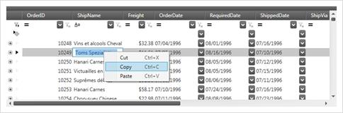
Excel-like Behaviors
Supports Clipboard interactions, undo/redo, sorting, and column resizing modeled after Microsoft® Excel®.
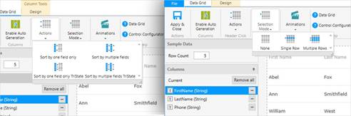
Sorting & Grouping
Sort by single or multiple data columns, and group columns in the same way you would in Microsoft® Outlook®. Group multiple fields together under a single common header with field grouping, and allow your end user to quickly see which fields fall under similar categories by nesting, moving, pinning, or collapsing.
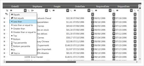
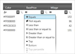
Enhanced Filtering
Supports record filtering as you type, based on a multitude of filter conditions including contains, greater/less than, and regular expressions.
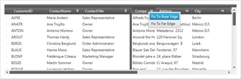
Fixed Headers, Pinned Rows and Moveable Columns
Offers complete control over scrolling through data, pinning and un-pinning data, and swapping data columns.
Complete Stylability
Supports built-in themes for quickly changing styles or through support of triggers and Visual State Manager for ultimate control.
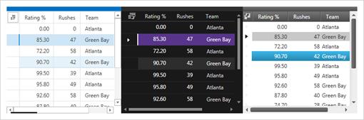
Real-time Highlighting
Highlight records and cells in real-time as they change and track the history of value changes.
Excel Export
Supports deep integration with exporting to Excel (.xls and .xlsx) without the need for Excel to be installed. In addition, Clipboard access allows direct links to copy to and from an Excel workbook.
Calculation Manager Support
Integrate the Calculation Manager with other XAM controls, including Data Presenter, Data Grid, Data Cards, and the Data Carousel. Various parts of these data presenters can be used as sources and targets of calculations, including fields and summaries.
External Sorting, Grouping, Filtering, and Aggregation
Developers can provide their own logic for the operations of sorting, filtering, grouping, and calculating summaries.
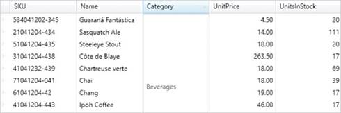
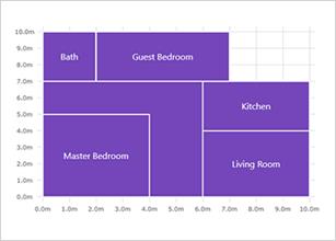
Cell Merging
Deliver clearer data and avoid duplication by merging neighboring cells with matching values across different rows.
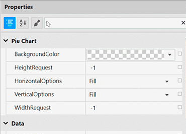
Data Grid Configurator
The control configurators shave hours off development time. No need to learn a complex API—just point and click to visually configure the xamDataGrid to get a pixel-perfect render of your design intent.
Launch the Data Grid Configurator with a Single Click
Select your control on the XAML editor and use the suggested actions lightbulb to launch the Data Grid Configurator.
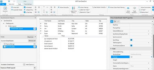
Visually Configure Your Data Grid
The ribbon provides access to the most common features of the xamDataGrid and is the easiest and quickest way to configure your data grid. If you want more control, customize almost every aspect of your data grid by utilizing the property grid, which exposes every option available for the selected xamDataGrid object. All settings you provide are rendered in real time on the design surface for you to validate your design.
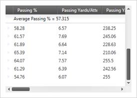
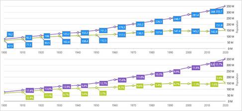
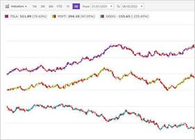
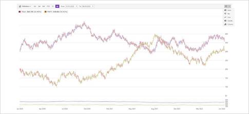
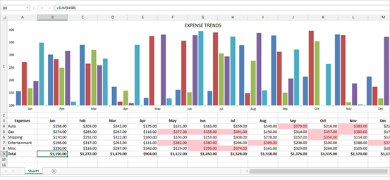
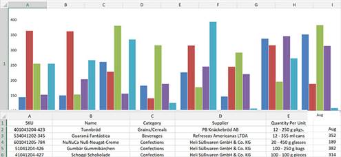
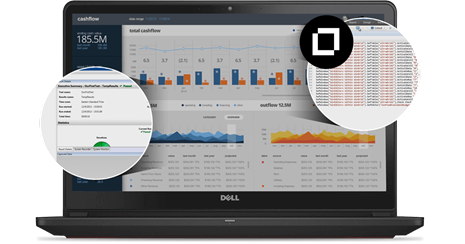
WPF Data Chart
Render WPF charts with millions of data points that are capable of millisecond updates and spare nothing to achieve blazing speed. Enable heavy-duty data visualization and analysis on large volumes of data with high performance. An improved Date/Time Axis supports Axis Breaks, Dynamic Intervals and Dynamic Labeling.
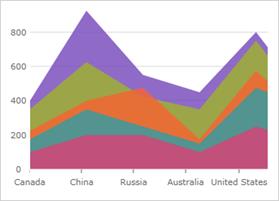
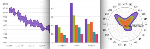
Over 75 Chart Types
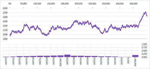
Real-Time Charting with Millions of Data Points
With this release, the speed and performance of our Data Chart have been significantly enhanced. This chart will display millions of data points and update itself every few milliseconds to handle your real-time needs.
High-Density Scatter Series
Bind and show scatter data ranging from thousands to millions of data points without sacrificing performance. Change the series resolution to adjust the performance level of rendering while dealing with massive amounts of data points in the chart.
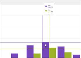
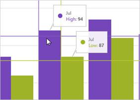
Hover Interactions
Activate a number of interactions when you hover over chart data series using the mouse or touch gestures. These hover interactions can display crosshairs or bar/column highlights to snap to actual data points. Attach tooltips to the hover interactions and lock them on crosshairs or to axes.
Modular Design
The WPF data chart control is designed for modularity of axes and chart series. Multiple axes and multiple chart series are supported.
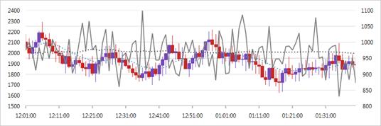
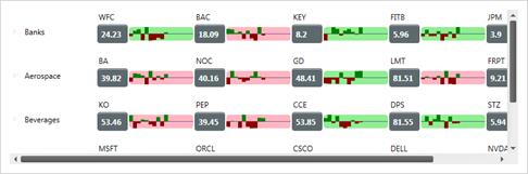
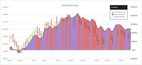
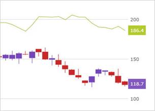
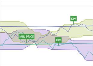
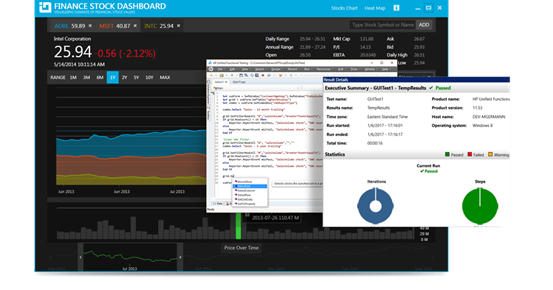
Financial Charting
Financial charting scenarios, with support for both Candlestick and OHLC bar chart, and many built-in technical indicators (like Moving Averages, Bollinger Bands, Money Flow Index, MACD, Wilder's RSI) are supported.
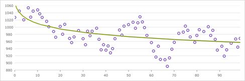
Trend Lines
Support for multiple types, including linear (x), quadratic (x2), cubic (x3), quartic (x4), quintic (x5), logarithmic (logn x), exponential (ex), and power law (axk + o(xk)) trend lines.
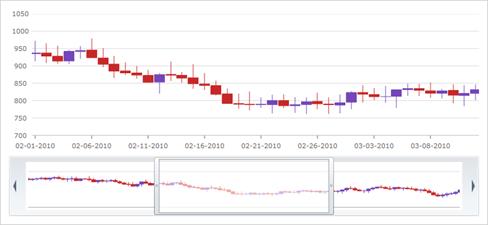
Interactive Panning and Zooming
Use the keyboard, zoom bar, mousewheel, or drag-select any rectangular region with the mouse to zoom in for close-up look at data points. When you can show millions of data points, the individual points lose their identity when completely zoomed out.
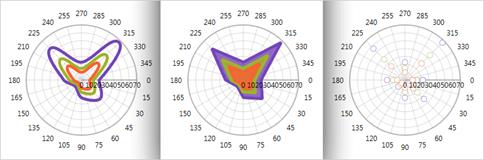
Scientific Charts
Polar series give insight to scientific data.
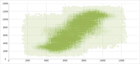
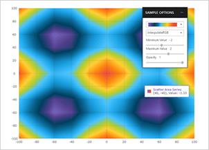
Scatter Area Series
The Scatter Area Series draws a colored surface, in a Cartesian context, based on a triangulation of X and Y coordinates with a numeric value assigned to each pixel of the surface. You can use this series to plot scientific data such as strength of magnetic field, 3-D shapes projected or flattened onto a 2-D plane, or correlation among three numeric columns in your data.
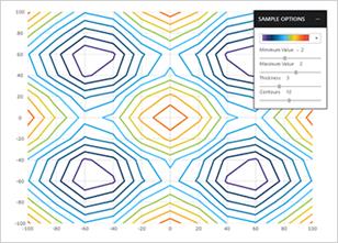
Scatter Contour Series
The Scatter Contour Series can plot the same data as Scatter Area Series, visualizing data using contour lines instead of interpolated surface area.
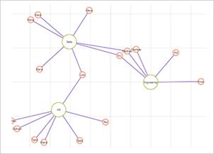
Scatter Polyline Series
The Scatter Polyline Series can plot outlines of custom shapes that are defined using a collection of collections of X/Y points. The series can show multiple connections between data points to indicate relegations or even build a view of networks.
Scatter Polygon Series
The Scatter Polygon Series can plot custom filled shapes that are defined using a collection of collections of X/Y points. The series can be used to highlight regions in the plot area of the chart.
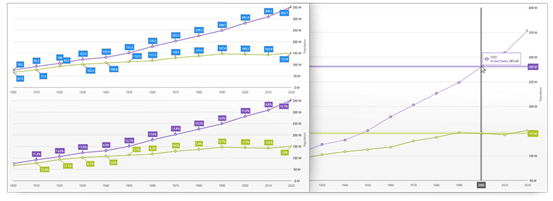
Date/Time Axis
The Date/Time Axis is an improved time axis that supports breaks, dynamic intervals, and dynamic labeling. The Breaks collection enables developers to configure the X-axis to omit dates in a range, such as weekends or other insignificant periods. The Intervals collection makes it easy to specify conditional label intervals based on the visible range of the axis, such as labels for each month when a year is visible. Label formats can also be configured according to the visible range.
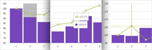
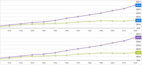
Final Values Annotation
Shows value of the last data point in your data source. Renders one colored box for each data source over Y-axis labels.
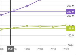
Crosshairs Annotation
Shows data point values at cursor location and renders these values in colored boxes over X and Y-axis labels.
Callouts Layer
Annotate important data points or customize values in callout boxes based on your logic (i.e. calculate maximum values in your data source).
Category Tooltip Layer
Renders a combined tooltip for all series in a data category.
Item Tooltip Layer
Renders an individual tooltip for each series in a data category.
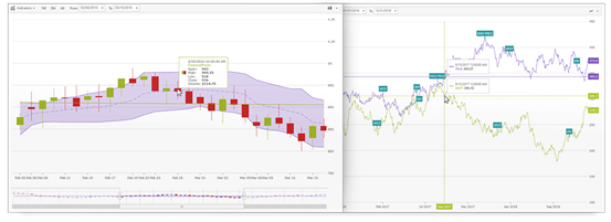
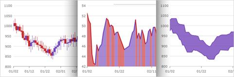
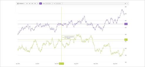
WPF Financial Chart
This lightweight, high-performance chart is easy to configure to display mission-critical financial data using a simple and intuitive API. Just bind your data, and the chart takes care of everything else. The WPF Financial Chart control is part of Infragistics’ best-in-breed UI for building high-performance, high-volume financial services, and capital market data applications.
Automatic Data Column Selection
The intuitive control automatically analyzes and selects data columns - Date/Time column to use for x-axis and Open, High, Low, Close, Volume columns or the first five numeric columns for the y-axis.
Visual Choices for Data Configuration and Display
The Financial Chart features a toolbar that allows end users to choose display options and selectors. Other views are Prices View, Volume View for trading volume, Indicators View, and Navigation View with zoombar for previewing.

Options for Visualizing Data
The chart gives users numerous ways to visualize and interpret data, including label formatting and multiple display modes for price, volume, and other financial indicators. Set the ChartType to designate Bar, Candle, Column, or Line charts.
Crosshairs Annotation
Shows data point values at cursor location and renders these values in colored boxes over X and Y-axis labels.
Final Values Annotation
Shows value of the last data point in your data source. Renders one colored box for each data source over Y-axis labels.
Callouts Layer
Annotate important data points or customize values in callout boxes based on your logic (i.e. calculate maximum values in your data source).
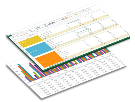
WPF Spreadsheet
This Microsoft® Excel®-inspired control allows you to embed Excel document creation and editing experiences right into your WPF applications.
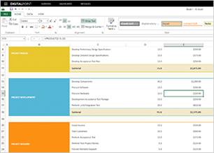
Excel Editing and Formatting
The xamSpreadsheet is built on top of our existing Excel Framework. It provides an interactive control and includes powerful editing and cell formatting features, all without the need for Excel to be installed on the machine.
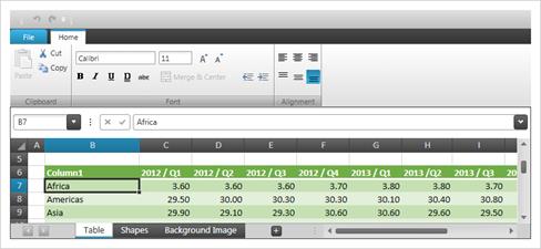
Full Familiarity
To give your users a seamless experience, the xamSpreadsheet is a pixel-perfect match to Excel. The high-performance spreadsheet has more than 100 familiar keyboard shortcuts, and 150 commands built right in, including pane freezing, named ranges, multiple worksheets, workbook/worksheet protection, and support for over 100 formulas.
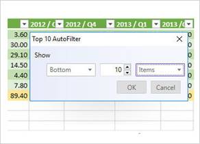
Sorting and Filtering
Table and worksheet-level sorting and filtering capabilities let you define and sort or filter an area by text, number, date, or color within a worksheet or outside a table. With the Custom Sort Dialog, Top 10 Filter Dialog, and Format Cells Dialog, you can secondary sort, sort by the top ten (or bottom ten) records, and adjust the way a spreadsheet displays data in a cell. You can also choose from a list of filters or create customized ones.
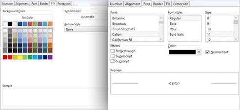
Cell Formatting
Right-click on a cell to use the Format Cells dialog box to format cell data. Modify number display, alignment, font, shading and borders, and protection of your worksheet data.
Conditional Formatting
Render all the conditional formatting features available in Microsoft Excel, including presets for data bars, color scales with two- or three-color gradients, and icons.
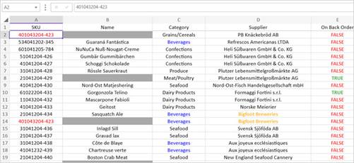
Table Management
Improved controls let you copy and paste entire tables, expand and edit tables, filter and sort table columns, navigate between rows, choose common formulas, and use the context menu to add rows, columns, and data to a table.
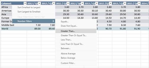
Chart Support
The WPF spreadsheet renders charts in a worksheet and includes support for over 36 chart types, including area, column stacked, pie, exploded pie, bar stacked, and many more. When the dataset for the chart changes, the chart will update to reflect any changes in the values.
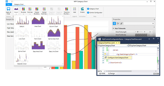
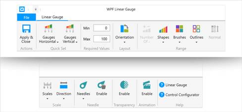
WPF Control Configurators
Infragistics Ultimate UI for WPF Control Configurators provide visual configuration of rich controls like charts, gauges, and the data grid right in the editor, shaving hours off your development time. Configure your controls and bind data directly from XAML files with pre-built styles and themes and WYSIWYG property editing — no coding required. Use the control configurators to learn the rich APIs of the WPF controls. Ultimate UI for WPF includes configurators for these controls:
Launch the Control Configurator with a Single Click
Select your control in the XAML editor and use the Suggested Actions lightbulb to launch the control configurator.

Visually Configure Your Control
Use the control configurators to visually customize almost every aspect of your controls. All the control configurators have a common layout: ribbon at the top, a property grid on the right, and several other options on the left, depending on the configurator you are using. Some configurators even ship with Quick Sets, which let you quickly configure your control by selecting one of the professional, beautifully-designed, pre-configured configurations.
Property Editing with Ease
Conveniently find properties grouped by related features in the Property Editor. Features are also enabled or disabled by feature compatibility. This lets you customize any detail of the control, and it helps you learn by example, as you can see in real-time how your changes affect the control.
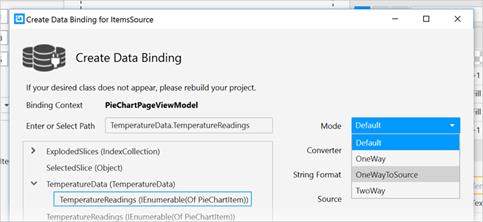
Data Binding is a Breeze
Use the Binding Editor to easily set a binding for a control, including binding mode or your custom converter. We’ve even provided a handy formatter so you don’t need to think about how to display your values.
Generate Code with the Click of a Button
Once you have configured the control exactly as you want it, hit the Apply & Close button and watch all the XAML code get generated for you. Even better, the configurator will read any changes you made in XAML and update the properties with our full, two-way XAML parser.
Test Automation for Micro Focus UFT
WPF and Windows Forms
Reduce testing time, increase productivity, and guarantee a higher-quality product with Test Automation for Micro Focus UFT.
Automated Testing of Your Windows Forms or WPF Apps
User Interface testing can be a painful process that often leaves you either tediously writing custom test code or not testing the user interface at all. This leaves your applications open to failure–a dangerous risk to take in today’s market.
To mitigate this risk, trust Test Automation for Micro Focus UFT.
These custom libraries enable automated testing of an application’s user interface within your preferred testing IDE, allowing quality assurance teams to fully regression test Windows Forms and WPF applications developed using Infragistics Ultimate UI for Windows Forms or Infragistics Ultimate UI for WPF.
Seamless Integration with Micro Focus’ Unified Functional Testing
When teamed with Micro Focus Unified Functional Testing (UFT), Infragistics test automation toolsets condense your quality assurance timeline and make it easy to deploy higher-quality Windows Forms and WPF applications faster, with less cost and risk.
Integrates Seamlessly
Test Automation integrates seamlessly with Micro Focus’ user-friendly software that comes with its own custom IDE designed specifically for testing.
Easy to Code and Follow
Test Automation coding is in a slimmed down version of VBScript, which is easy to code and follow.
Intuitive Design
Test Automation visible properties are streamlined to show those that are most useful to the tester, and the recorded methods are generally intent aware.

© Copyright 2000-2026 COGITO SOFTWARE CO.,LTD. All rights reserved