It is widely believed that students and others spending their 2020 spring break in Florida helped spread COVID-19 far and wide, in the US and elsewhere (see also this study). The picture in 2021 is quite different in several ways. For one, the disease has been in the US for over a year, and an approximated 30% of the population has antibodies from prior exposure. Also, several vaccines are now in use, and close to 20% have received at least one inoculation at the time of this writing. (Since those two groups overlap, the total is believed to be in the ballpark of 45% of the total population.) We now know that children under the age of 16 do not get the disease in large numbers and are not a major vector for its spread. Social distancing practices are in use to varying degrees, and infection numbers are currently falling across the country. This is believed to be due to a combination of increased immunity and non-pharmacological interventions (NPIs) such as social distancing and mask use.
The proverbial elephant in the room is the emergence of several new variants of SARS-CoV-2, all possessing unfortunate characteristics. The new variants seem to be more contagious than the initial forms of the virus. Some appear to do a better job of evading antibodies formed in response to exposure from the prior forms. There is a concern that some may be less amenable to countering by at least some of the existing vaccines (this is the topic of a recent study). In locations where they first appear, they all seem to have become the most prevalent form in the viral pool. These critters are termed variants of concern (VoC) for good reason. I list the ones under scrutiny here, using the genomic designation followed by the location of origin (corresponding to the names commonly given to each) in parentheses. They are B.1.1.7 (England/UK), B.1.351 (South Africa), B.1.427 and B.1.429 (Southern California), P.1 (Manaus, Brazil) and B.1.526 (New York City).
As we are now beginning a new spring break season, it is timely to look at the picture from Florida in terms of these variants. I cannot give a current view, however. My data comes from the GISAID repository of SARS-CoV-2 genome sequences, as it is the largest that is available to all researchers (GenBank from the NCBI is also good, and it can be accessed directly from the curated SARS-CoV-2 sequences in the Wolfram Data Repository). Due to the lag time between specimen collection, laboratory sequencing and eventual upload to GISAID, of necessity this data does not include current or recently collected sequences. Typically, there are very few samples from the past three weeks, and virtually none from the past two. What I will show is the outlook as we went from mid-February to late February.
These variants are characterized by specific (overlapping) sets of mutations. Of course, the gold standard (for purposes of classification) is to detect one of those sets of mutations in a given sequence. For that purpose, one needs to know in careful detail what to look for. And the search can take place within a “noisy” landscape: other mutations can be nearby, some characteristic mutations might be themselves slightly altered by further mutation, etc. I do not have the resources to navigate such shoals. I rely instead on a general-purpose approach to genomic comparison, one that happens to work fairly well for the purpose at hand.
Outline of the Method
This brings us to a (mercifully?) brief description of the strategy used here to analyze genomic sequences of SARS-CoV-2. Recall that genetic DNA and RNA sequences can be characterized as strings comprised of four letters (A, C, G, T), using U instead of T in RNA sequences. These correspond to the four nucleotides adenine, guanine, cytosine and thymine/uracil. Sequences can be compared using direct string-comparison computations. These are the alignment methods. Loosely speaking, techniques that avoid direct string comparison fall into the family known as “alignment-free methods.” The latter often enjoy advantages of better speed and versatility, at the expense of typically delivering somewhat weaker results. My approach begins with something called the chaos game representation (CGR), wherein gene sequences are illustrated as fractal-like square images. This method was pioneered three decades ago by Joel Jeffrey, and has been refined along the way. Many practitioners, myself included, nowadays use a version known as the frequency chaos game representation (FCGR).
Once one has images for genetic sequences, there still remains the question of how to compare them. For the FCGR, there is a pixelation level involved that determines the size of the image: at level 
 there are
  pixels. My typical setting is to have
 set to 7 or 8, so that’s either 16K or 64K pixels (here I use the common convention that 1K is
  , or 1024). Stated differently, at a pixelation level of 8, the images are 256×256.
I show a couple of these images, cribbed from a prior Wolfram Community post (I forget which one in particular):
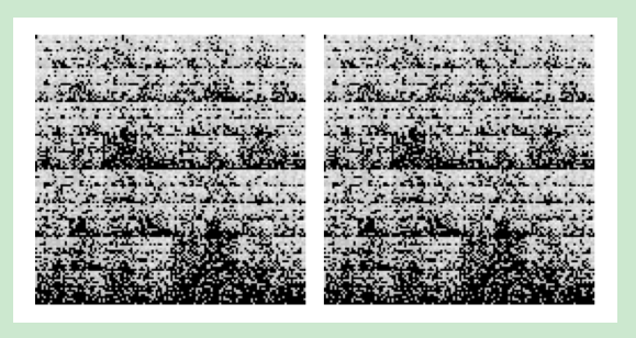
Comparing objects with 64K elements is a daunting task, and we do not try to do that. Instead, we use two fairly common methods of dimension reduction to bring these to a more manageable size.
First, we use the discrete cosine transform (DCT) to cull out high-frequency components in the images. This has the effect of coarse-graining the images by removing “noisy” high frequencies. One might ask why we do not simply use coarser-grained FCGR images. The answer is that those simply do not work as well as the finer FCGR images with higher-frequency components removed. In any case, my typical setting will retain a 32×32 array of frequency components from the original 256×256 FCGR image.
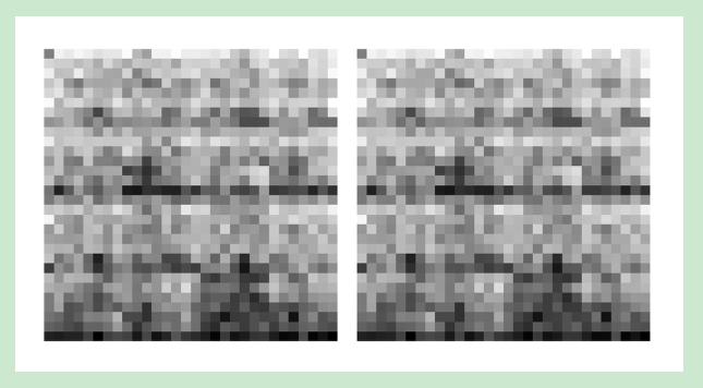
Once we have a set of these images, with dimension reduced using the DCT, the next step is to use a method known as principal components analysis (PCA), which in turn is based on a linear algebra matrix function known as the singular value decomposition (SVD). Here is what the previous pair looks like after the dimension-reduction steps (and a bit of manipulation to recreate them as images):
Thus far, this post has been a mass of technical terminology. Readers interested in a detailed exposition (with pictures and algorithmic complexity analysis) can have a look at my article on the subject, published at the end of 2019. On the same day (December 30), Reuters published an article about an unusual outbreak of a pneumonia-like disease in Wuhan, China. So I had a set of tools and, within a few short weeks, a viral outbreak generating data on which to apply them. Something much tamer would have been preferred, but we don’t always get to choose.
I should remark that there is a growing body of literature on the topic of using FCGR-based methods to classify the SARS-CoV-2 genome. I have done this as well in a series of posts on Wolfram Community (see “Genome Analysis and the SARS-CoV-2,” “From Sequenced SARS-CoV-2 Genomes to a Phylogenetic Tree,” “Analyzing the Spread of SARS-CoV-2 Variants in California” and “Analyzing the Spread of SARS-CoV-2 Variants in Florida”). But I am by no means the only person doing such things. What I have done that is perhaps novel is to show that these methods can detect differences at the level of variants. Published papers show how the genome fits within the family of sarbecoronaviruses, for example, but those that use the FCGR do not (as far I am aware) attempt to compare and/or cluster different variants of SARS-CoV-2.
Clustering the Variants of Concern
For reference, the sequences I downloaded from GISAID were sets of the five variants that were collected during certain time periods in 2021. The idea was to be certain they were fairly recent (and, indeed, one of these variants was only identified in 2021), and to use time periods sufficient to get in the ballpark of 200–400 samples for each. I also downloaded three sets collected in Florida during three successive time periods in February. GISAID requires that proper attribution to collecting and sequencing laboratories and researchers be provided for genetic sequences used from that site (and, rather helpfully, they have an automated way of obtaining this data as formatted PDF files). I include cells with this content in the notebook version of this post.
First, I will show a picture of the several variants. Each point represents a particular genomic sequence. The data points are obtained by yet another round of dimension reduction, this time to 3D using a method known as multidimensional scaling (MDS):
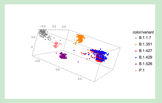
The main point here is this. Even after reduction from genomic sequences (comprised of nearly 30 thousand nucleotides, in the case of SARS-CoV-2) to 3D vectors, there remains sufficient information content to discern very distinct clustering of the several variants. The seeming exception (the red/blue intermixing) is from the two close relatives that together comprise the California variant.
There are a handful of outliers as well. This is not terribly surprising. For one, noise mutations that are not essential to the variant status will have some influence on where these appear in the 3D image. Also, it is not a certainty that every reference sequence is perfectly categorized. And it is plausible that some might have been classified without having all mutations specific to their variant. This can happen, for example, when classification is done using genetic marker tests.
I should mention that there are a number of useful ways to reduce dimensions. Indeed, several are built into the Mathematica function DimensionReduce. One such method, called latent semantic analysis (LSA), is a cousin to MDS. But I prefer the latter, and while it is not (at this time) available via DimensionReduce, there is a version of MultidimensionalScaling readily available in the Wolfram Function Repository.
Florida Sequences from February 9 to 12
To indicate which sequences are likely to belong to one of the variant classes, I will create what are called phylogenetic trees, which are dendrograms based on measures of genetic proximity. What’s a dendrogram? Have a look at the documentation for the function Dendrogram. The reader is to be warned that the remainder of this blog is likely to be monotonous, since it is mostly just these tree graphs. In my experience, monotony is the rule when it comes to data analysis. But one can glean useful information, and that’s what actually matters.
First, I show another MDS plot. This time, I decimated the variant sequences by a factor of 3 in order to avoid clutter (and this will be all the more important when we look at the trees). I tried to show a viewing perspective that would give a reasonably accurate idea of which sequences from Florida appear to cluster among the variants. One sees several in the B.1.1.7 (gray) sequences, and likewise for the blue and red. This also appears to happen with the purple and pink clusters. We will see that those last two are a bit misleading. What happens is that three dimensions are not always sufficient to separate nonrelated sequences. (One can, of course, use three-dimensional images that emphasize non-overlapping aspects, but that amounts to using six dimensions and is still difficult to visualize.)

A Phylogenetic Tree
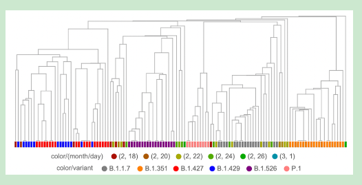
A phylogenetic tree plot can give a better idea of whether sequences are related. In addition to proximity of placement, there is the length of tree branches that separates a given pair from their closest common branching point. We make use of this in the following tree. Here, we decimate the variants by a factor of 6 for readability (I have pored over trees that use less decimation—but the clustering of the Florida sequences among the variants and the relative branch lengths do not change by much):
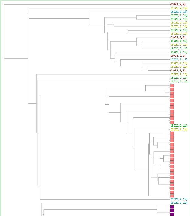
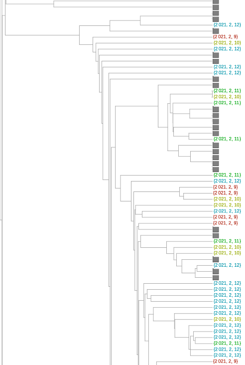

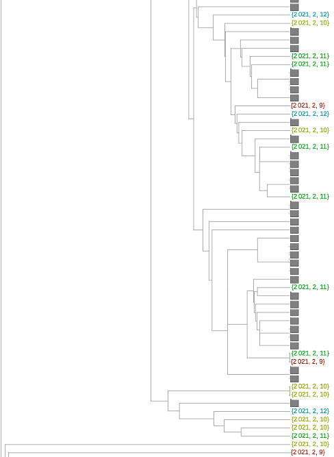
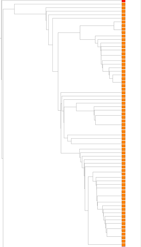
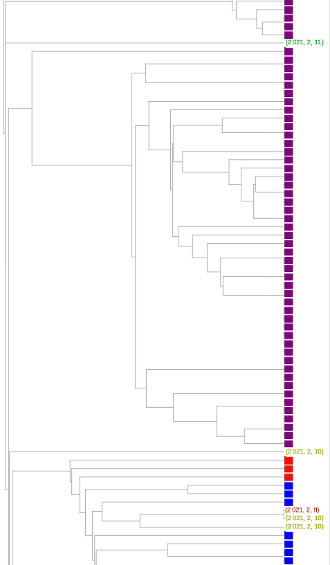
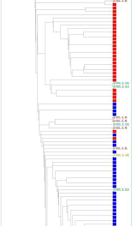
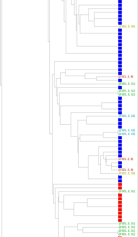
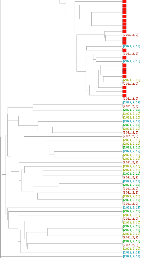
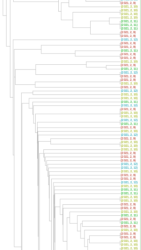
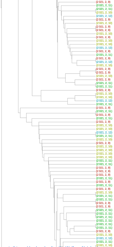
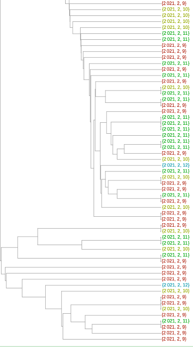
There are but two sequences that cluster among the pink P.1 variant. The one that might be with the purple 1.526 variant really has a branch too long to consider it as likely to be that variant (although this is a heuristic, and I would not state that as a certainty). My own estimate is that 84 are plausibly the B.1.1.7 variant and 35 are one or the other class of the California variant. Overall, this amounts to around 29% of the Florida sequences collected during February 9 to 12.
February 13–17
We move up a few days, analyzing SARS-CoV-2 sequences collected in Florida during February 13 to 17:
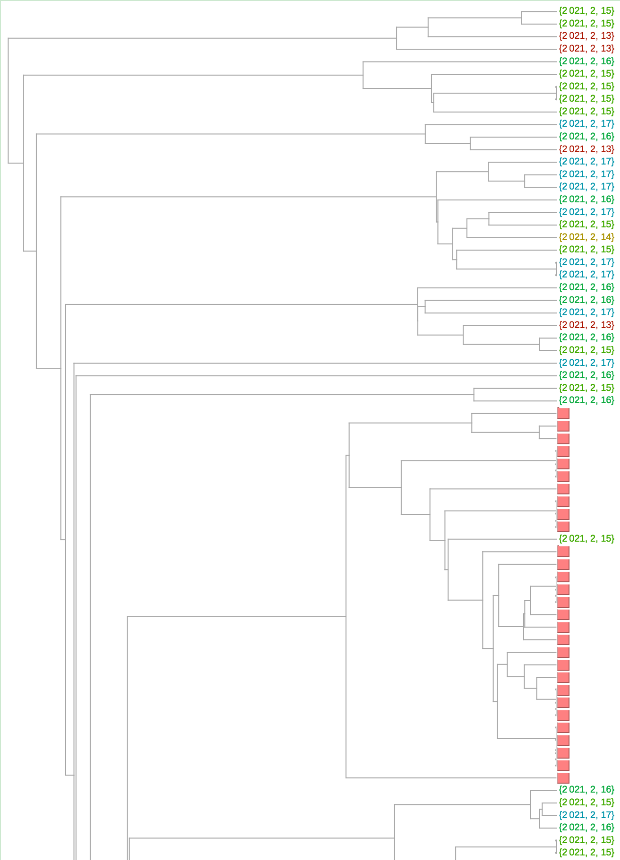
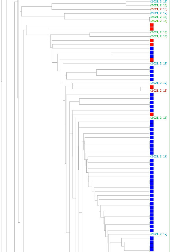
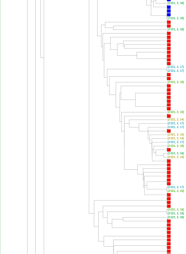
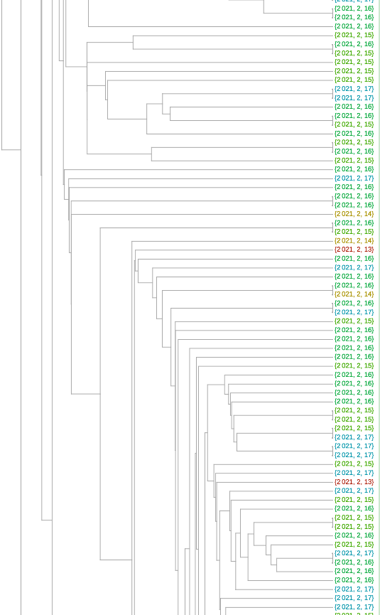
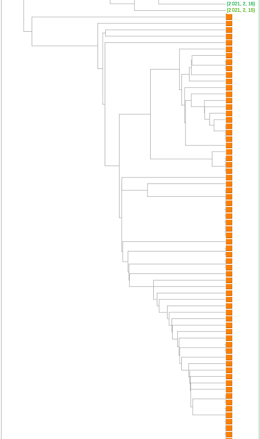
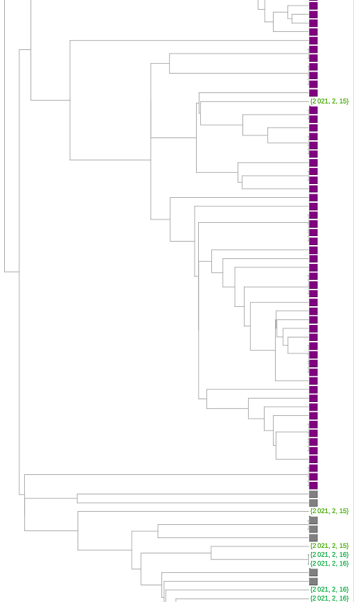
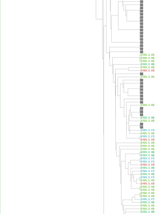
Eyeballing it, I see one each of the P.1 and B.1.526 variants, 32 of the B.1.427/B.1.429 variant and 56 of the B.1.1.7 variant. There are 292 in total from our test set, so this time, around 31% of the total is comprised of the variants.
February 18 Onward
The most recent set, collected on or after February 18, is comprised of 270 sequences. All but 17 were collected no later than February 25, so this set is from more than three weeks ago at the time of this writing (March 16):
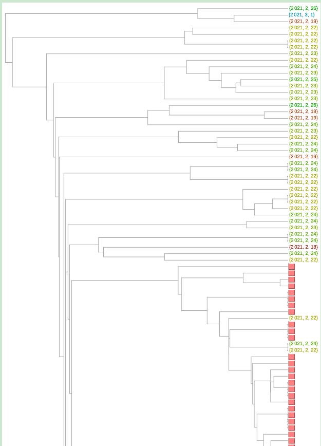
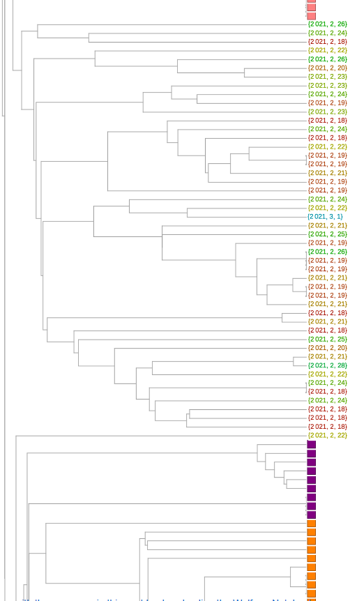

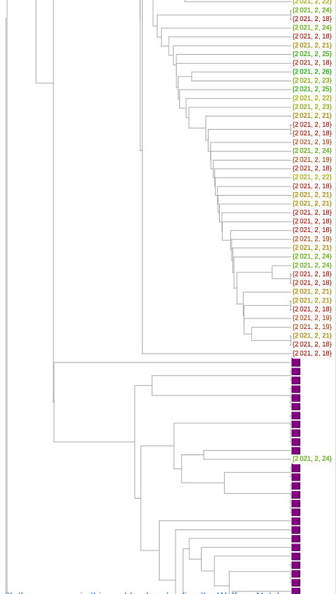
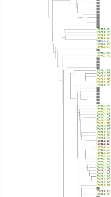
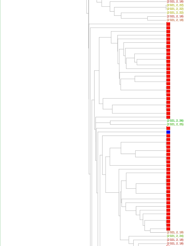
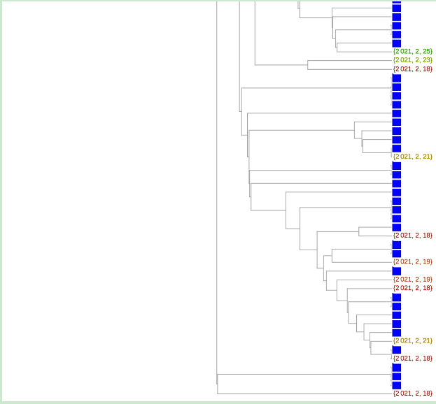
It appears that there are now three and five from the P.1 and B.1.526 variants, respectively. At least 26 appear to be from the B.1.427/B.1.429 family. And there are now 63 from the B.1.1.7 variant. That amounts to 36% being comprised of the variants.
We have seen an upward trend during the month of February in percentages of the variants present in Florida. This is not terribly unexpected; epidemiologists had predicted this would happen. At present, based on data such as from genetic marker tests (which is more recent than what is available from GISAID), the B.1.1.7 variant is said to account for 36% of all current cases in Florida and is believed that it will hit 50% in the near future. What I have shown can be viewed as corroboration, with the caveat that some of the other variants (in particular the one from California) are also on the rise. Moreover, recent news claims the total number of new confirmed cases per day in Florida has stopped declining and has perhaps even risen modestly (it is currently around five thousand). This is not a great scenario. On the brighter side, spring break is bringing a smaller influx to Florida than it did last year, and this time a percentage of the population (including many of the most vulnerable) will have received vaccinations prior to the post-break exodus.
© Copyright 2000-2025 COGITO SOFTWARE CO.,LTD. All rights reserved